Carbon Graphs: An Open Source Visualization API
We are pleased to announce Carbon Graphs as an open source code project!
Carbon is a lightweight, vanilla JavaScript visualization API built with D3 that integrates well with any consumer’s tech stack. It provides a variety of graph types that are framework agnostic and responsive out of the box.
Motivation
Over the past few years, we have gradually updated our user interface to use modern JavaScript libraries such as mithril.js and React. Our components needed a graphing solution that would work well with our current framework while providing visualizations based on leading industry solutions.
We did an extensive audit of various Cerner solutions already available, the graph types they were using, and the libraries used to plot the data. We discovered that most solutions had graph implementations baked into their product such that they were modifying or extending open source libraries in an effort to support Cerner’s unique clinical and accessibility needs. These implementations, however, could not be broadly reused. As such, we saw an opportunity to collaborate with our User Experience team to create an attractive, modern, and flexible graphing solution that not only would meet Cerner’s design standards, but that could be open sourced to give back to the engineering community for their own graphing needs.
Graph Types
With Carbon, you get:
- Line graph
- Multiline graph
- Spline Line graph
- Non-Contiguous Line graph
- Paired Result graph
- Timeline graph
- Bar graph
- Pie chart
- Gantt chart
Graphs come with following settings that be customized:
- Legend
- Labels
- Grid lines (Vertical and Horizontal)
- Axes (X and Y, or Y2)
- Regions (Horizontal only)
Carbon also supports functionalities that are not provided with popular open source libraries such as:
- Support for custom SVG shapes as data points
- Support for different standard shapes (dark or light) as data points
- Locale support for axes ticks
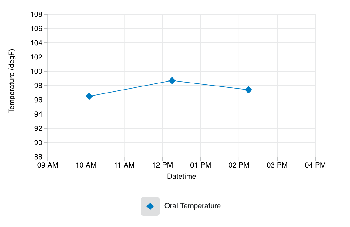
Drawing a Line Graph
Let’s see how easy it can be to get started!
To create a line graph, first create an HTML element that will hold the graph. Here, we are specifying a main element with an id of root.
<main id="root"></main>
From there, we will initialize a JavaScript object that configures various aspects of the graph, including where the graph will be drawn and how the axes should appear.
const graphConfiguration = {
    bindTo: "#root",
    axis: {
        x: {
            type: Carbon.helpers.AXIS_TYPE.TIME_SERIES,
            label: "Datetime",
            lowerLimit: new Date(2016, 0, 1, 9, 0).toISOString(),
            upperLimit: new Date(2016, 0, 1, 15, 59).toISOString()
        },
        y: {
            label: "Temperature (degF)",
            lowerLimit: 90,
            upperLimit: 106
        }
    }
};
Next, we’ll configure the dataset we want to plot.
const dataset = {
    key: "uid_1",
    label: {
        display: "Oral Temperature"
    },
    shape: Carbon.helpers.SHAPES.RHOMBUS,
    color: Carbon.helpers.COLORS.BLUE,
    values: [
       {
            x: new Date(2016, 0, 1, 10, 5).toISOString(),
            y: 96.5
       },
       {
            x: new Date(2016, 0, 1, 12, 15).toISOString(),
            y: 98.7
       },
       {
            x: new Date(2016, 0, 1, 14, 15).toISOString(),
            y: 97.4
        }
    ]
};
And to wrap it all up, we’ll call loadContent to draw the content.
const graph = Carbon.api.graph(graphConfiguration);
graph.loadContent(Carbon.api.line(dataset));
That’s it!
Contribute!
We are continuously working on improving Carbon to support our ever-increasing clinical needs! Help us make it better by reporting issues using the GitHub issues queue or feel free to contribute with pull requests.